

OVERVIEW
Description:
Moolah is a user-first budgeting and savings app designed to make money management social, intuitive, and stress-free.
Goal:
To identify gaps in existing budgeting and expense-sharing apps and design a solution that feels more social, intuitive, and inclusive. Moolah introduces features focused on shared financial goals, collective budgeting, and seamless bill splitting—developed through competitive analysis and user-centered research.
Context:
This case study was created as part of Google's UX foundations course on Coursera. This module was focused on solving real user problems through research-driven design.
USER RESEARCH
Research Methodology:
To understand how people manage shared budgets and track expenses, I started by asking users directly about their experiences.
I created a short survey to learn about their habits, preferences, and frustrations with existing budgeting apps.
Then, I spoke with a few users in one-on-one interviews to dive deeper into their challenges and what they really value in collaborative money management.
This combination of survey and interviews gave me a clear picture of the pain points and opportunities, which guided the design decisions for Moolah’s features and user experience.


KEY TAKEAWAYS
Through surveys and user interviews, several key insights emerged:
-
Users feel awkward reminding friends about shared expenses, indicating a need for subtle, socially comfortable ways to request payments.
-
Tracking progress toward shared savings goals is challenging, suggesting the importance of clear visualizations and motivational cues.
-
Users want simplicity and clarity in expense management, as overly complex interfaces discourage regular use.
-
Notifications and reminders need to be friendly and non-intrusive to support timely interactions without creating social friction.
These takeaways will directly inform the design of Moolah, focusing on ease of use, collaborative transparency, and positive reinforcement to improve user engagement and satisfaction.
COMPETITOR RESEARCH
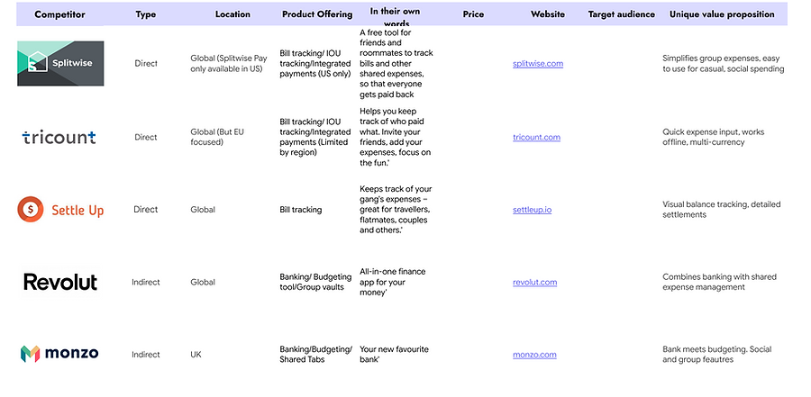
Research Methodology
To identify opportunities and best practices for Moolah, I conducted both a comparative audit and a competitive analysis of existing budgeting and expense-sharing apps. The goal was to understand how different apps approach key features such as shared expenses, goal tracking, and user engagement.
The comparative audit allowed me to directly compare functionality, usability, and visual design across several apps, while the competitive analysis helped uncover market trends, gaps, and unique approaches that could inspire Moolah’s design strategy.
This research provided valuable insights to inform feature prioritization and create an experience that addresses real user pain points while standing out in the market.
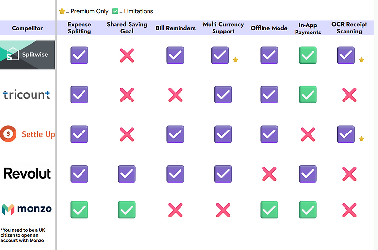
KEY TAKEAWAYS
From analyzing Splitwise, Tricount, Settle Up, Revolut, and Monzo, several patterns and opportunities emerged:
-
Shared expense tracking is functional but often impersonal: Most apps allow users to log expenses easily, but they lack subtle ways to remind friends without creating social friction.
-
Goal tracking varies widely: Only some apps provide clear, motivating visuals for shared savings goals, leaving room for more engaging and intuitive designs.
-
Onboarding and simplicity matter: Apps like Tricount and Settle Up are straightforward, while others (like Revolut and Monzo) can feel complex for new users managing shared expenses.
-
Notifications and reminders: Effective notifications are rare; users either forget or feel awkward prompting friends about payments.
-
Collaborative transparency is key: Users want a clear, at-a-glance view of who owes what and progress toward collective goals.
These insights highlighted opportunities for Moolah to combine simplicity, friendly reminders, and engaging goal tracking into a cohesive, user-focused experience.
MOOD BOARD
Thought Process
For Moolah, I wanted a brand that feels friendly, approachable, and motivating. I decided on a soft, rounded blue “M” paired with a cute yellow star to its right, symbolizing achievement and positivity. I chose a color palette that spans from bright yellow to deep navy/purply blue, with a range of pastel tones in between, to create a balance of energy and calm.
This mood board and logo guided my design choices throughout the app, helping me keep the visual identity cohesive, playful, and user-friendly.

To be continued... I am actively working on the rest of this case study and project :)
Disclaimer:
This portfolio is a work in progress. I am actively building and refining it while completing my learning journey in UX design, so case studies and projects are unfinished and still being updated and expanded.